
Materials
QR codes for payments: where they save time and where they just add a step
A payment QR does not make paying faster. It removes one specific chore — copying digits. That is why it wins wherever a customer still has to type an account number by hand, and loses wherever a card terminal is already sitting on the counter.
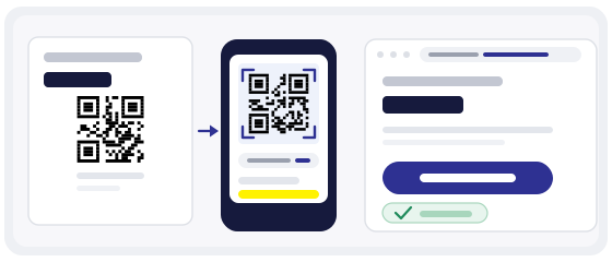
Not sure about a code? The scanner shows the address before it opens.
Check a codeWhat is actually inside the code
Start with the simplest part, because most confusion lives here. An ordinary payment QR made on this site contains an address — the same one you would have reached by typing it out. Nothing more.
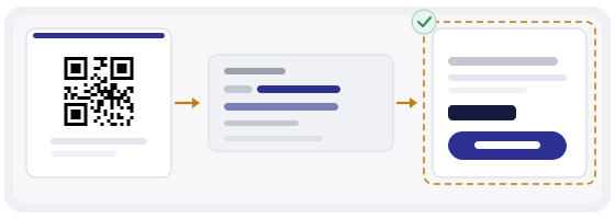
The code does not hold money, does not authorise a transfer and does not add security. Everything that protects the transaction happens on the page that opens after the scan.
A QR code is an address, not a button. Asking whether a code is safe, separately from asking where it leads, has no answer.
That is not a limitation to work around. It is a precise description of the tool, and it tells you straight away where to look: not at the picture, but at the address behind it.
Where it genuinely wins
The gain is always the same one: typing disappears. A long string of digits, where one wrong position ruins everything, is replaced by a single tap.
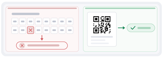
It shows most clearly on small invoices. That is exactly where a customer postpones payment until later, because it means opening a laptop, finding the password and digging out an email. A code in the corner of the document removes all three excuses at once.
Where it only adds a step
In fairness, there are places where a payment QR makes things worse. There are not many, but they are real.
- A till with a card terminal — the person is already holding a card, and you are asking them to go hunting for something else.
- A page already open on the screen — if paying is one tap away, the code is a step backwards.
- Recurring payments inside an app — the card is already saved and there is nothing to type.
Hence a simple rule: put the code where typing is an obstacle. If there is no obstacle, the code solves nothing — it just adds a tap and a “why, though”.
The mistake that costs money: an out-of-date address
The most common problem with payment codes is not fraud. It is a code baked into an invoice template that points at a page which stopped being current two years ago.
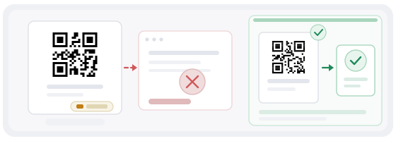
Payment pages change more often than people expect: a new provider, a new legal entity, a rebuilt checkout, a different bank account. The document template carries on, and nobody remembers there is a code inside it.
Then the boring part happens. The customer pays, the money lands in the old account, the business spends a week tracing the payment, and by then the customer has decided you are not very organised. Nobody hacked the code. Nobody checked the address either.
So a code on an invoice is as much a part of the document as the amount and the bank details. It deserves the same habit: check it every few months, and every time the provider changes.
A fixed amount, or an empty form
This is not a choice between good and bad. It is a choice between two different jobs.
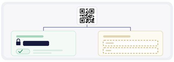
A fixed amount means the customer sees a field that is already filled in and simply confirms. Fewer chances to get it wrong, fewer questions, faster. But if someone wants to pay part of it or add a tip, they have to go another way.
An empty form means the customer enters the amount. That suits tips, voluntary contributions, and any situation where the figure changes every time. The catch is that every entry is another chance to add or lose a zero.
If you can fix the amount, fix it. One “confirm” button is always more reliable than a field somebody has to fill in.
A sticker on top of a sticker
Payment code fraud exists, and it almost never involves breaking the code itself. It involves a different code ending up in front of the customer — stuck over the original, swapped inside a frame, replaced at the counter.
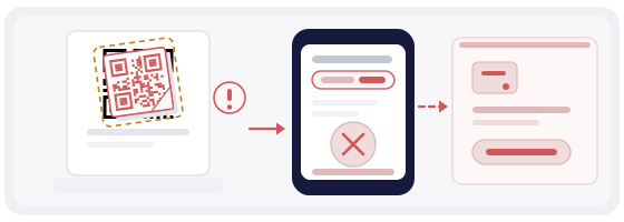
- before confirming, look at the recipient name and the amount — not just the logo
- never scan a code stuck on top of another one, however tidy it looks
- check the codes at the till and on tables: a paper sticker is very easy to cover
- do not pay through a code a stranger sent you in a chat, however convincing the message
- check the address before you follow it — the QR scanner shows the contents first
The best defence here is not technical, it is human. A sticker that was not there yesterday will be noticed by the person at the till — provided somebody told them to look.
There is more on this in the separate article about sticker swapping.
What has to be printed next to the code
The temptation to print only the square is understandable, and it costs money. Some customers will not scan at all: an old camera, a company account that cannot pay from a phone, or simply a preference for transferring from a laptop in the finance office.
So leave ordinary text alongside it: the account number or IBAN, the recipient name, the payment reference and a short address for the payment page. In many countries this is a requirement for the document itself, not just a convenience.
A simple rule: someone without a camera must be able to pay the same invoice without asking you for help.
When the payment does not go through
This happens far more often than fraud, and the cause is almost never the code. The customer's bank declined the transfer. The amount exceeded a daily limit. The page opened inside a messenger's built-in browser, where payments simply do not work.
So next to the code it is worth having not only the address but one short line: where to turn if something goes wrong. And one place is better than three — a person who has to write to three different addresses will not bother paying at all.
For yourself, keep one habit: check that the code opens in a normal browser, not only in the one you tested with. Embedded browsers behave differently, and that is where most complaints come from.
Size and material for a counter
Payment codes are usually small and live where a person has already stopped — the till, the table, the bottom corner of an invoice. So: compact, high contrast, no artistic liberties.
- 2–3 cm for a code at the till or on a table, 8–10 cm for a wall sign
- dark on light, no inversion — not every phone reads a light code on a dark background
- matte finish: gloss bounces lamps and windows straight into the camera
- label it in plain words — “Scan to pay” plus the business name
- no logo in the middle: payment addresses are long and the code is already dense
A long address means many modules in a small area. That is exactly why a plain black-and-white code genuinely beats a decorated one here: in a dense code every extra element takes away legibility.
A dynamic code, and its honest price
A dynamic code keeps the printed pattern and lets you change the address it points to. That saves you reprinting every sticker and every invoice template each time a provider changes.
It also shows how many times the code was scanned. For invoices that is unexpectedly useful: most businesses assume the code on their invoice works and have never measured it.
But there is a condition worth stating plainly. A dynamic code goes through a redirect, and if that redirect stops working, the printed codes stop too. So keep your own record of the final payment address — in a contract, a procedure document, anywhere, but not only inside one service's dashboard.
How to do it in practice
Paste the payment page address into the generator, pick the link type, keep the colours simple and download SVG for print or PNG for screen.
If the code has to sit inside a layout — the corner of an invoice, a table card, a card by the till — QR Studio sets the size and resolution for print, so the code is not squeezed into whatever space is left.
Then run the finished code through the QR scanner and test it on a phone that is not logged into your payment dashboard. That way you see exactly what the customer sees.